The Ultimate Guide to Comic Fonts and Lettering
Improve AI comic pages with better fonts, speech bubbles, captions, sound effects, spacing, and lettering choices that keep panels readable.

ComicsAI Editorial Team
Editorial Team
Lettering: The Invisible Art
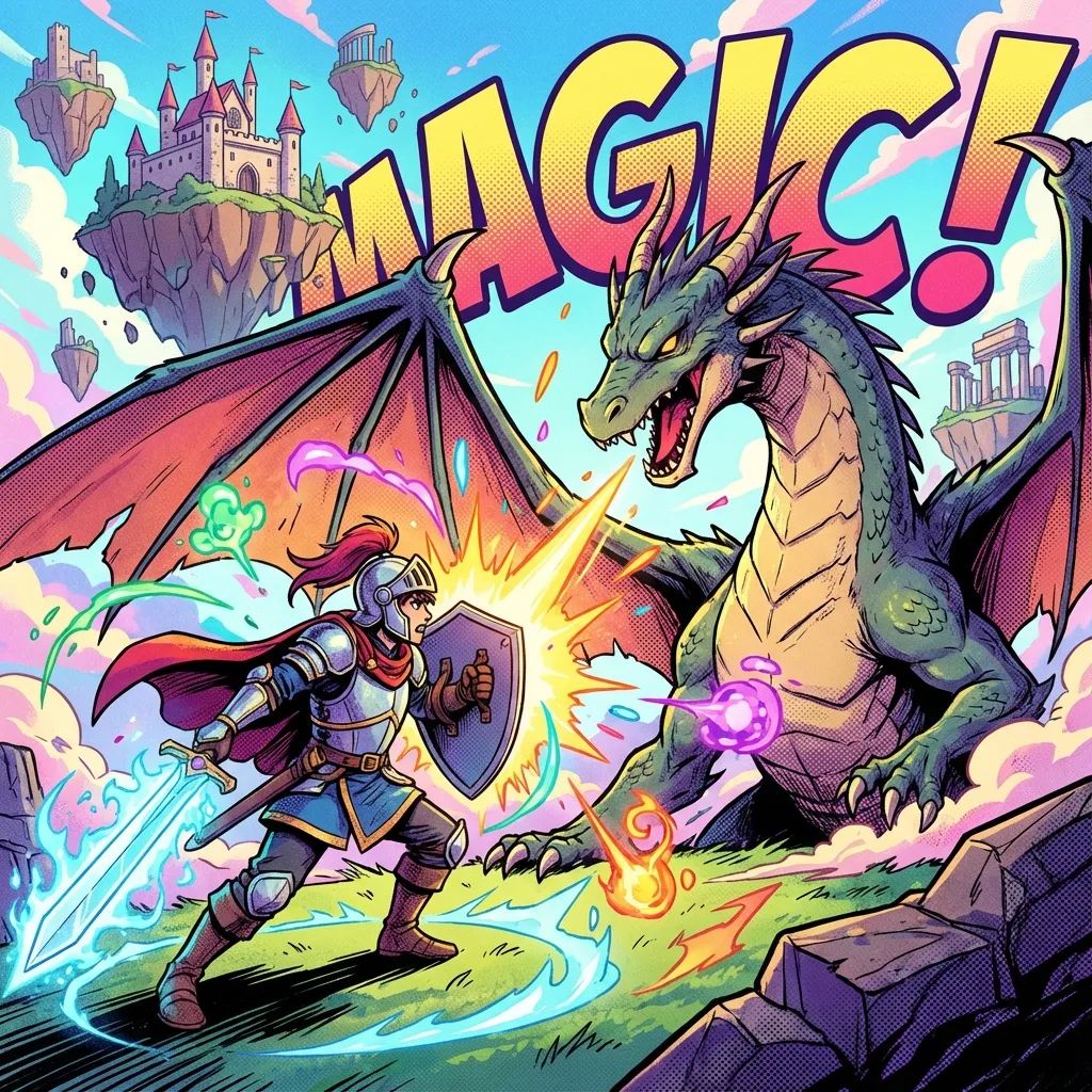
You've generated stunning AI panels, but if your speech bubbles look amateurish, the illusion is broken. Good lettering is invisible—it guides the reader without distracting them.
1. Choosing the Right Font
Avoid Comic Sans at all costs. Instead, look for professional comic fonts.
    - **Dialogue:** Use readable, hand-lettered style fonts like *Anime Ace* or *Wild Words*.

    - **Sound Effects (SFX):** Go bold and expressive. Brush style fonts work great for 'BOOM' or 'WHOOSH'.
2. Speech Bubble Placement
The placement of bubbles determines the reading order.
    - **Flow:** Place bubbles in a 'Z' pattern (left-to-right, top-to-bottom).

    - **Don't Cover Important Art:** Avoid covering faces or key action details.

    - **Tail Direction:** The tail should point towards the character's mouth, covering about 50% of the distance.
3. Hierarchy and Emphasis
Use bold text for emphasized words, but don't overdo it. Change font size to indicate volume—smaller for whispers, larger and jagged for shouting.
Tools for Lettering
While ComicsAI creates the images, you might use tools like Photoshop, Clip Studio Paint, or even Canva to add text. ComicsAI is also rolling out integrated lettering tools to streamline this process.
ComicsAI Editorial Team
Editorial Team
"ComicsAI editors publish practical guides about AI comic creation workflows, tools, and creator education."