Design for a stranger
The cover has to work before the reader knows the plot. Prioritize genre, protagonist signal, conflict, and title space over detailed story explanation.
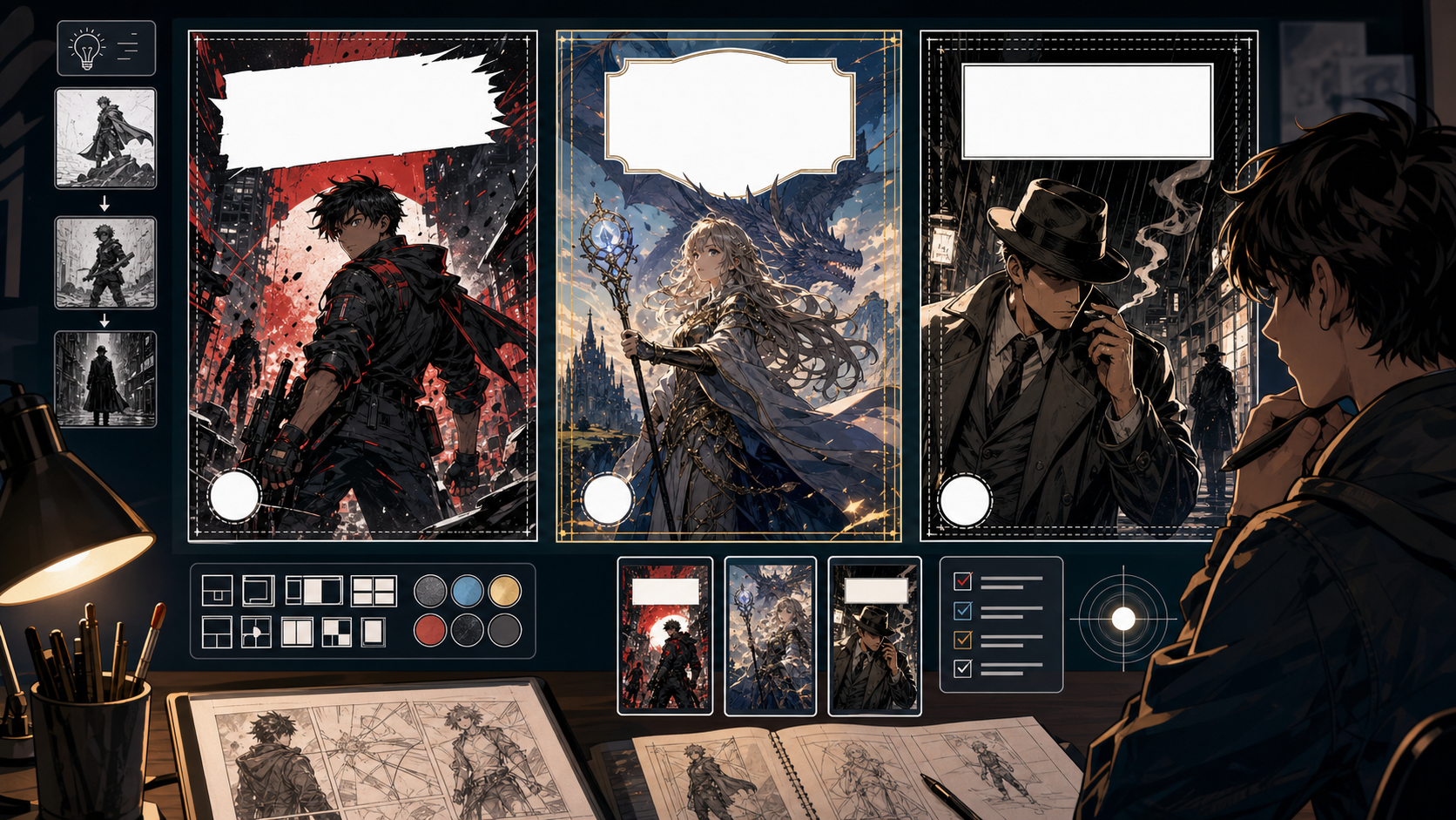
Comic Tools
Comic Cover Generator helps turn a story promise into a cover image that can sell the genre, character, conflict, and title space at a glance. It is built for thumbnails, issue covers, pitch visuals, and launch graphics.
Practical take
A cover is not just a beautiful scene. It has to communicate what kind of story this is, who matters, what the tension is, and where the title can live. Use this tool when you need a visual hook before a reader knows the plot.
The main mistake is making the cover too literal. A good cover often simplifies the story into one symbol, pose, conflict, or atmosphere. Leave space for typography before the image becomes too busy.
Workflow
Cover generation should begin with the selling idea: genre, protagonist, threat, title zone, and thumbnail readability.
Decide whether the cover promises action, romance, horror, comedy, mystery, fantasy, or drama.
Pick one character pose, prop, face, silhouette, or scene symbol that carries the story identity.
Ask for a clean top, bottom, or side zone before generating. Title placement is not an afterthought.
Shrink the image mentally. If the subject disappears, simplify contrast and shape.
Generate options with different mood, crop, and title placement, not just different colors.
Prompt craft
A useful Comic Cover Generator prompt begins with the asset you need, not a list of style adjectives. Give the model a visible subject, the production role, and the review focus: focal point, crop, panel hierarchy, gutter logic, caption space, and how the image connects to the next beat.
Subject + visible change + page or panel draft role + comic covers, series key art, launch thumbnails, and social preview art + hero pose, title space, readable silhouette, genre signal, and strong value contrast + review rule: decide the cover hierarchy before generation: title, face, action, or world.
make a comic book cover
a space mechanic holding a cracked sun core above a ruined city, designed for comic covers, series key art, launch thumbnails, and social preview art, with hero pose, title space, readable silhouette, genre signal, and strong value contrast; make the reader understand that decide the cover hierarchy before generation: title, face, action, or world; leave clean space for later editing and keep the focal point clear.
The stronger version names the subject, the visible change, and the asset role. It also tells the tool what success looks like for comic layout: focal point, crop, panel hierarchy, gutter logic, caption space, and how the image connects to the next beat.
Quality signals
A strong comic cover works small, works fast, and leaves room for typography. Judge it as packaging, not a panel.
The cover should quickly suggest what kind of comic the reader is about to open.
There must be a believable area for logo, title, subtitle, or creator name.
The main shape should still read when the image is small.
A cover should tease the story, not explain every event.
Visual examples
Cover examples should be judged by promise, silhouette, title zone, and thumbnail readability.
A cover draft should test protagonist signal, genre promise, composition, and clean title space before typography is added.
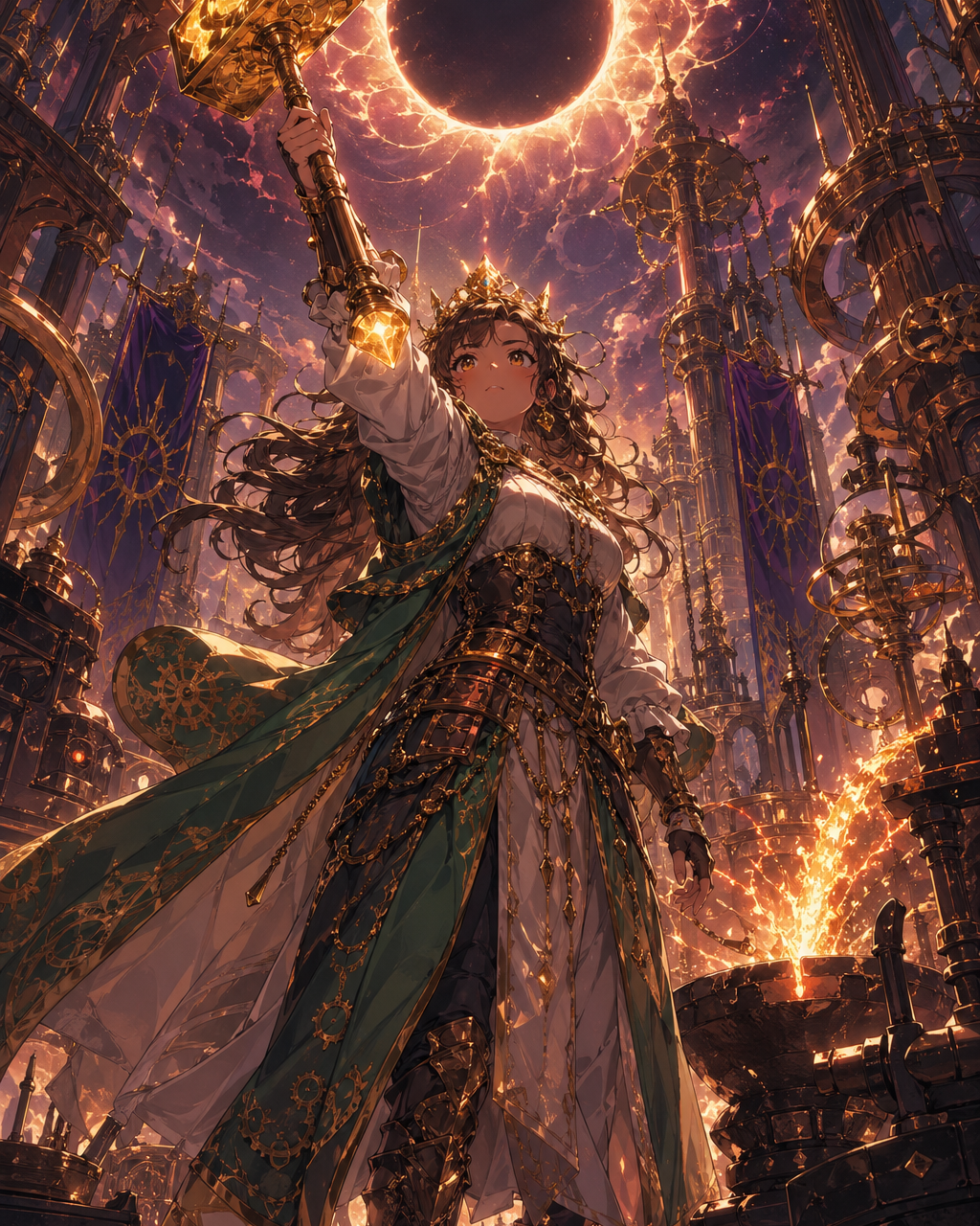
The character pose and lighting should tell readers what kind of story they are entering.
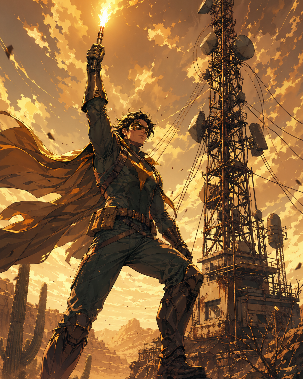
Simple shapes and a strong object can sell a concept faster than plot detail.
Creator field guide
These notes help creators decide what to plan, what to ignore, and when a draft is ready for the next production step.
The cover has to work before the reader knows the plot. Prioritize genre, protagonist signal, conflict, and title space over detailed story explanation.
Mentally shrink the cover to search-result size. If the main figure, mood, or title zone disappears, simplify the composition before adding detail.
Generate art with intentional blank zones. Add the title and logo as editable type so the cover can be revised for campaigns, languages, and formats.
Field notes
A comic cover has a different job from a comic panel. A panel serves sequence; a cover serves promise. It needs to communicate genre, protagonist energy, conflict, and visual hierarchy before the reader knows anything about the story. That is why cover prompts should talk about title space, thumbnail readability, and central symbol rather than trying to summarize every plot event.
The most common cover mistake is narrative overcrowding. Creators often want the hero, villain, location, side characters, magical object, and final battle all in one image. The result may look rich but fail as packaging. A stronger cover usually simplifies the story into one memorable figure, one object, one situation, or one mood that can survive a small thumbnail.
The workflow should also be honest about typography. AI-generated text inside cover art is often not reliable enough for final use, especially for logos, author names, and translated editions. The better workflow is to generate art with a clean title zone and add editable type afterward. That gives creators more control over branding, localization, and campaign variants.
Cover variants should be compared by communication, not only beauty. One version may have better rendering, but another may sell the premise faster because the title zone is cleaner, the silhouette is stronger, or the genre promise is obvious at phone size. This is a useful paid workflow: create several cover directions, choose the best marketing read, then refine typography and crop for store thumbnails, social previews, and episode cards.
Create a cover concept for a chapter, one-shot, or serial update.
Test whether the story reads at small size.
A cover is not finished if the logo has nowhere clean to sit.
One memorable promise beats a collage of every story event.
After the cover direction works, continue with title generation, comic logo work, character design, or panel generation for the story itself.
Include genre, protagonist signal, central conflict, mood, title placement, and thumbnail readability. Avoid listing too many story events.
Usually no. Generate clean title space and add typography separately for sharper, editable lettering.
Yes, but webtoon covers often need stronger mobile readability and simpler character silhouettes than print-style covers.
The prompt is likely trying to summarize the plot. Reduce it to one promise, one subject, and one clear title area.